

Most men do not want to wear a billboard on their chest. They want a quiet acknowledgment of the effort they put in when no one is watching. Finding a gift for a man usually means guessing what he will not hate, defaulting to plain navy cotton because we are terrified of buying him something corny. We debated the Break The Limit design for three weeks because getting the tone right is the difference between a shirt he actually wears outside the house and one he only puts on to clean the gutters. Here is exactly what we fought over before the presses ran.
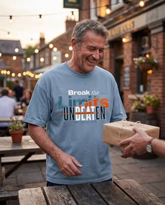
4 Things We Argued About Before Printing Break The Limit
1. The Louder First Draft We Threw Out
The original mock-up had the words "No Excuses, Only Results" in 72-point block letters across the back shoulder. It looked exactly like a loud promotional billboard for a suburban fitness boot camp. We scrapped it on a Tuesday morning after looking at the test print under the harsh warehouse lighting. The men's graphic tees that actually get worn by grown men do not scream at the people walking twenty feet behind them. We stripped the text down to three words on the front left chest. A man in his forties does not need to announce his daily work ethic to the cashier at the grocery store. He wants a piece of clothing that feels personal, not promotional.
2. Keeping the Next Generation Line
The back print reads: "Stay focused, break the limit, and let the next generation try to catch up." Half the room thought it sounded arrogant and pushed to cut it. We argued about it for two solid hours in the stockroom, leaning against boxes of blank garments. Someone suggested softening the text to "inspire the next generation." We vetoed that immediately. We kept the original line because it is not a boast; it is a standard. It is the exact kind of quiet, internal dialogue of a father who still wakes up at 5:00 AM to run three miles, or a mentor who leads by setting a pace the younger guys struggle to hold. It is the quiet hum of a guy who simply does not quit.
3. Choosing a Fabric That Looked Five Years Old
A fresh, stiff motivational shirt feels like a novelty item purchased at a weekend corporate seminar. We refused to print this design on a crisp, bright blank. The message needed to look earned, like he had already put in the miles and the hours. We chose a heavyweight 100% ring-spun cotton that undergoes a specific garment-dyeing process. This breaks down the fibers just enough to wash out the starkness of the raw color, leaving a muted, chalky finish. If you are curious about the mechanics of that dye process, we detailed exactly why some t-shirts feel old and soft on day one (and who should get one). The result is a relaxed drape that falls naturally. When he pulls it out of the shipping bag, it already feels like his favorite shirt from 2018.
4. Nailing Down Exactly Who We Were Making This For
The final argument was about the wearer himself. We realized early on that we were not designing for the guy posting gym selfies with a tripod. We were printing for the man working at a wooden garage workbench at 6:00 PM, sanding rough timber after his actual shift ended. We were making it for the quiet partner who never complains about the financial or emotional load he carries for his family. When you understand how to style a graphic tee: 4 outfits and a size rule for a relaxed fit, you realize the garment has to match the lifestyle, not the other way around. He pairs this with faded denim, oil-stained canvas pants, and scuffed work boots. It fits seamlessly into a life that is already full of heavy lifting.
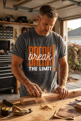
A bold statement lands entirely differently when it sounds exactly like something he already says to himself on a hard, quiet day. The right apparel does not sit folded at the bottom of the drawer; it becomes the shirt he reaches for when he has work to do. Take a closer look at the Break The Limit tee for the man in your life who sets the pace without saying a word.


