

A tiger t shirt is easy to get wrong. Add a snarl, drop in some orange, call it done, and you get a costume graphic: something that reads fine on a hanger and flat everywhere else. What makes a tiger t shirt read like art instead of a decal comes down to a series of small calls made before the first stripe ever hits fabric, and that process is worth walking through in order.
Field to sketch: choosing the reference that carries weight
We start by ruling out the obvious pose. A generic roar (mouth wide, teeth bared, front-facing) reads as clip art the moment it's printed at scale, because there's no direction for the eye to follow. Instead we look for reference photos with an angled head, a shifted weight, an ear turned toward something off-frame. That off-center detail becomes what we call the energy line: the invisible diagonal running through the animal's posture that tells the eye where to travel next. A tiger mid-turn, caught between two directions, holds attention longer than one staring straight out.
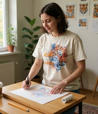
Sketching happens the same way each time, at a drafting table with the reference photos taped up in a loose grid so we can compare posture across five or six shots before committing to one. That habit of studying the whole animal before drawing a single line is the same thing that turned a wildlife animal t shirt into a signature piece for people who wear one animal consistently rather than a rotating cast.
Stripes as structure, not decoration
Once the pose is locked, the stripes get built to do a job: they follow the muscle line, thin out where the body curves away, and thicken slightly where we want the eye to pause. Negative space matters as much as ink. A print with stripes packed edge to edge collapses into noise at a glance, while leaving open fabric between clusters lets the design read clearly from six feet away, which is the distance most people actually see a shirt from a room over.
Palette versus fabric: why the same file looks different on three shirts
The same tiger artwork gets test-printed on Pepper, Ivory, and Sports Grey before any color is finalized, because pigment behaves differently on each. A neon orange that looks correct on Ivory can turn flat and slightly plastic on Pepper unless the underbase (the white layer printed beneath the color to block the dark fabric showing through) is adjusted in density. Too thick and the color sits on top like a sticker; too thin and the black cotton bleeds through, muddying the orange into brown. Getting the underbase right is what keeps a bright color vivid without looking synthetic.
Quote integration: when the words earn their place
Not every tiger print needs text, and we test each one without a line first to see if it holds attention on its own. When a quote does get added, it sits in a supporting role: smaller point size, placed below the shoulder line, never overlapping the animal's face or breaking the stripe flow. The goal is a hierarchy where the art leads and the words confirm what the viewer already felt looking at it, the same balance we worked out building a tiger design where the message had to support the animal, not compete with it.
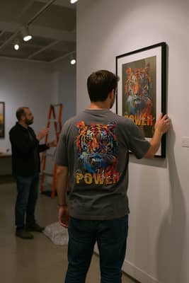
That hierarchy is easiest to see in a gallery setting, where a framed print gets hung at eye level and judged the same way a shirt graphic should be: as one composed image, not a slogan with a picture stapled to it.
How we build a tiger t shirt print
- Select reference photos showing an angled pose with a clear energy line, not a straight-on stare.
- Sketch the stripe structure to follow muscle direction, leaving negative space so the design reads at a distance.
- Test-print the full palette on Pepper, Ivory, and Sports Grey to check how each color holds against the fabric tone.
- Adjust underbase density until neon and bright colors stay vivid without looking plastic on dark cotton.
- Add quote text only if it strengthens the piece, sized and placed to support the animal, not cover it.
- Run wash and sunlight checks, then shift graphic placement by a few millimeters to fit how the shirt actually drapes on a body.
Print and wear tests: what changes after the first wash
A print that looks correct on a flat table can shift once it's worn. We run wash cycles to check whether ink cracks along the stripe edges, and separate sunlight checks to see which colors fade first. Orange and yellow tend to lose saturation before black does, so we print those slightly richer than they'll need to be at delivery. Placement also moves by a few millimeters between drafts, because a design centered on a flat mockup can sit off-center once it's on a rounded chest, and that's the kind of thing you only catch by putting the shirt on an actual body and watching how the fabric falls, the same way a quiet morning in a wildlife animal t shirt shows more about drape and fit than any flat photo does.
If you like seeing how the tiger shows up before it roars, follow our studio updates for the next work-in-progress drop.


