

If you typed pink elephant t shirt, you’re probably not hunting novelty. You want bold elephant art that reads pink-first on the body, with grown-up color and depth. We land that by starting on a garment-dyed Violet tee instead of bubblegum pink, because pink ink needs contrast to look like intentional color, not a washed-out blush.
How to make pink pop on a violet tee
- Start with garment-dyed Violet (Comfort Colors 1717) to give pink a cool field that increases perceived saturation.
- Print a warm off-white underbase on all pink areas, flashed to a soft gel to keep edges crisp.
- Lay a magenta-rich pink top color in two thin passes to avoid banding and keep highlights clean.
- Feather midtones toward tusks and wrinkles with a higher-mesh screen so the elephant reads dimensional.
- Edge-control the tusk lines and the “Stay Humble & Grounded” type with a tighter stencil and micro-registered trap.
- Cure to ink-film temp 320–325°F with a 60–70s dwell; protect the garment-dyed hand by avoiding overbake.
- Spot-check under 3000K (indoor) and 5500K (daylight) light to confirm it still reads pink-first.
- Wash-test 20 cycles, cold water, low-heat dry; confirm no chalking on the magenta channel.
The brief: what a pink elephant should look like on an adult tee
The request we kept hearing: bold elephant art, grown-up palette, not cute. Pink is the accent that signals personality, but grown-up pink needs structure. On a light pink shirt, pink ink sinks into the ground and flattens. On Violet, the same pink lifts. We tested swatches at 9 a.m. under a D50 booth and again at 6:30 p.m. in warm room light; the Violet base kept the elephant vivid in both.
Color decisions: why pink over Violet works
We map our pinks from warm coral to cool magenta and test them against garment-dyed Violet. The winning mix is magenta-leaning with a tiny warm bias so it doesn’t turn purple on the shirt. We run a warm off-white underbase only where the elephant and the accent type live, flashed just until it kisses: 6 seconds at 230°F surface temp. That underbase keeps the pink clean and separates highlights so the trunk and ears don’t read like a sticker.
Undertone control matters. A cool underbase made the tusk highlights look sterile; a too-warm one dulled the Violet. Our shop mix sits in the middle: enough warmth to stop chalking, not so much that it muddies the shadow folds around the eye. If you’re curious how we approach color hierarchy on a different animal, see how we staged blacks and ambers in Inside the Stripes: How We Build a Tiger T Shirt That Reads Like Art.
Print craft: screens, passes, edges, and cure
Dark garments want an underbase; the trick is keeping it thin. We pull the underbase through 156 mesh for coverage, then print the pink through 230 mesh to preserve gradient. Two top passes beat one heavy pass: less risk of banding, smoother roll-off on the forehead where the light hits. Around the tusks and the “Stay Humble & Grounded” line, we run a 0.25 mm tighter stencil and a 0.2 mm choke on the underbase so the pink lands with a clean halo and the type edges stay ink-sharp at arm’s length.
Comfort Colors’ garment-dyed cotton has a hand people buy for; we protect it. Our conveyor dryer is set to 325°F air with a 65-second dwell. We confirm with a probe strip that the ink film reaches 320–325°F and then release. Overcuring flattens the print and can gloss the surface; avoiding that keeps the art matte, closer to paper than plastic. For context on why we obsess over feel, our Fox T Shirt Buyer’s Guide breaks down how fabric and print build decide whether you’ll wear a tee twice or two hundred times.
Wear test: light, washes, and why it still reads pink
We test in the wild. Daylight first: 11:15 a.m., open shade under a market canopy, 5500–6000K ambient. The Violet sits back; the pink steps forward. Indoors at 3000K, the underbase keeps the elephant from sliding into purple, so the eye still catches pink before it reads Violet shirt.
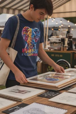
We ran 20 home wash cycles: cold water, fragrance-free liquid (1 US tbsp per load), inside-out, low-heat tumble (130–135°F exhaust). After cycle 5 and 20, we checked the midtone of the ear fold against our print card. No chalking, no visible banding; the magenta channel held, and the highlight on the trunk kept its snap. At arm’s length in a hallway with 2700K bulbs, it still reads “pink elephant,” not “purple elephant.”
The same build adapts when the base garment shifts. On Maroon hoodies we warm the underbase half a step to fight the red ground, and we cap the magenta at one top pass plus a light kiss to avoid oversaturation at the seam. The late-sun test at 5:12 p.m., low angle, golden hour, still reads pink-first.

How to spot quality when you’re comparing options
When you scroll options for a grown-up pink elephant, look for three tells. First, the base color: Violet (or another cool field) will make pink look designed, not accidental. Second, the highlights: if the forehead, tusks, and ear edges are blown out or muddy, the printer didn’t control underbase and mesh. Third, the hand: a soft matte print after cure beats a thick gloss; it wears more like art on cloth than a decal. Those same principles carry across the wildlife animal t shirt world, from peacocks to wolves and tigers, because contrast, undertone, and edge control are what make a graphic read like art and not novelty.
Want to see the pink-on-violet build up close? Browse the process shots and final elephant tee in our studio gallery.


